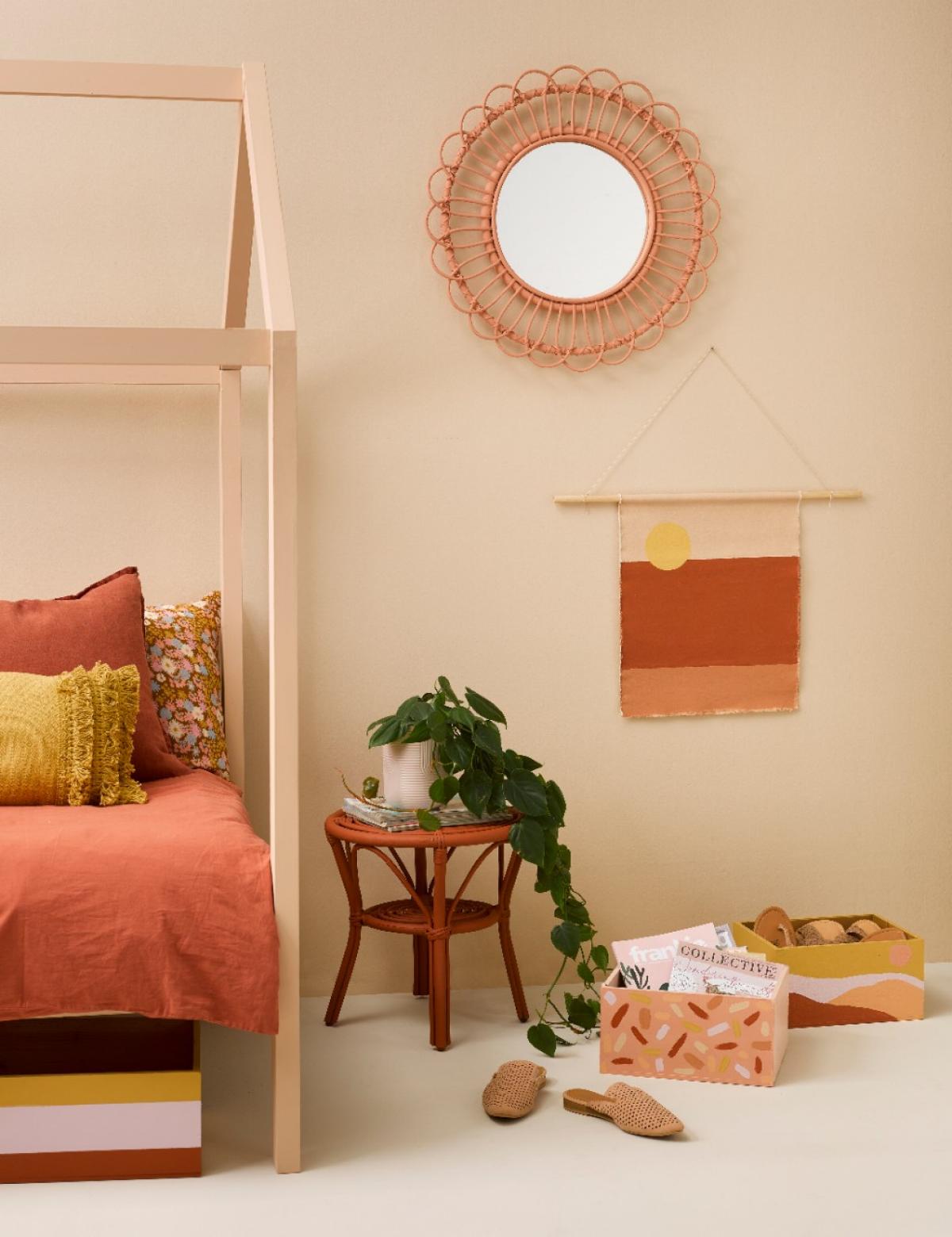
Yoga, meditation, a long soak in a hot bath - all are tried and true routes to relaxation. But the lesser-known path you may be overlooking? A tonal interior colour scheme.
A tonal approach to decorating sees different strengths of a single shade, or similar shades within a single colour family, combined to create a cohesive, layered look which soothes the senses.
Incorporating lighter and darker variations of your chosen base colour creates an on-trend effect that's simultaneously built to last, and easy to achieve at your place with a little insider know-how.
Let's talk tonal
Hawke's Bay-based stylist and owner of homeware store Blackbird Goods, Gem Adams, is a big fan of a layered look. Adams says although she's tended to embrace it in the form of texture, the more she delves into colour, the more she loves it.
"The tonal style adds so much depth and creates real interest without being over the top. I'm a busy-brained gal, so I'm always trying to create calm in my surroundings," she explains.
"Tonal schemes do this for me. Whether it's with neutrals or brighter colours, a spectrum of variation - opposed to high contrast - manifests the feeling I'm hoping for."

She says tonal decorating is great for those who are averse to taking big risks with colour but still seek a less than ordinary look.
"New Zealanders have historically been a little more subdued in their interior choices… but as we become more adventurous, working with tones is a way to experiment without pushing us too far from our comfort zone.
"It's a trend but also an enduring look that can evolve with us."
Beige brigade
Taking a tonal approach may be the most fuss-free and foolproof way to paint, as decision-making becomes simple when you have your eye on one prize hue.
A great way to start is with a whites and neutrals fan deck - a fantastic tool for discovering which neutrals go together. Displaying several variations and strengths of a colour on each card, it'll give you a solid understanding of what this look is all about. Choose a single base colour, then at least two other strength versions of it - one lighter, one darker - that are sufficiently different to offer visual interest.

Some might say ubiquitous neutral beige is boring, but as part of a tonal scheme, it's anything but - and extremely easy to live with.
Greys are another neutral that can create an effortlessly harmonious tonal effect. For winter, mid-toned sandy grey Half Stack, armament grey Stack and militant Double Stack make a cosy combination you can complement with accessories in cream and blush.
In fact, grey is a compelling prospect for both inside and out.
"My husband and I are currently planning the paint for the exterior of our 1910 cottage, and wanting something reminiscent of its heritage that also makes an impact, we've gone with smoky grey Tapa and urban grey Gravel, both deep tones that complement each other in a fresh way," says Adams.
Brighten up
If you'd prefer to inject a little more colour into your home, Adams says she's fan of the dusty tonal combo of sweet toffee Nougat, sandalwood Baroque, terracotta Twizel and ginger brown Desperado. She says deepening your understanding of the colours you're deliberating over will help you create a cohesive scheme.
"Are they cooler or warmer? Do they have blue, yellow or red undertones? Pairing like with like is always pleasing in the eye."

Nature also puts together tonal combinations like a pro. Look to the blue-on-blue of sea and sky - think pastel astral Seagull, mid-sea blue Shakespeare and heavenly Hemisphere. Otherwise he green-on-green of native bush with mid-toned Norway, murky Highland and forest green Dingley. Building your palette with gradually intensifying hues lets you combine several colours with confidence knowing they'll never overwhelm.
Pull it together
To stop a tonal colour palette becoming bland, up the ante with accent hues and textures that both provide a break for the eye and the contrast this look needs to come to life. Choose accent colours of the same ilk, such as a dusty pink highlight amid chalky greys. You might like to turn your attention to opposites on the colour wheel - a single bright red piece in pure chromatic red Havoc surrounded by true blues, for example, or a pop of gem-like purple such as showy Christalle in an emerald green scheme.

Keep in mind that the essence of this look is its minimalist sophistication, so you're aiming for subtle excitement rather than a shouty statement.
When we're talking texture, timber and other natural materials such as raw linen and wool are top teammates for a neutral palette. Include some textured wallpaper, velvet furniture or a woven throw or rug. Use affordable and accessible testpots to paint a vase or two in an accent hue, then fill it with dried flowers or foliage that complement your tonal colour family. If you find decorative pieces in shapes you love but colours you don't, you can also use testpots to paint them in your chosen tonal hues.
For more ideas and inspiration check out the latest on trend looks online.
This article was written by Resene for Newshub.


